Painting vs Poster: Which Finish Should You Choose?
8 June 2026·5 min read
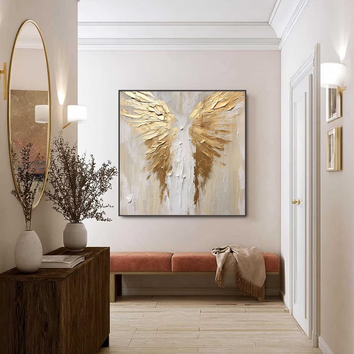
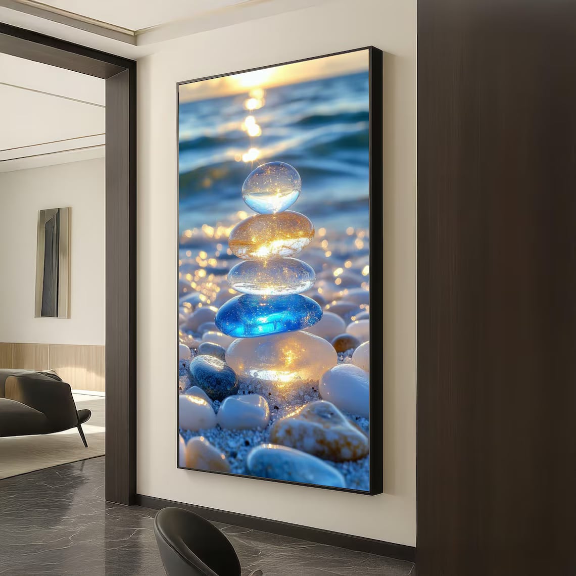
Same artwork, two very different personalities. The Painting finish is textured and hand-made; the Poster / Print finish is crisp and photographic. Here is how to choose.
See them side by side
Quick comparison
- Surface — Painting is textured & matte; Print is smooth & flat.
- Best subject — Painting suits abstract/floral/classic art; Print suits photography, maps and graphics.
- Light — both handle bright rooms well (neither is high-gloss); Painting is fully glare-free.
- Character — Painting is one-of-a-kind with slight variation; Print is consistent and repeatable.
Choose Painting if…
- You want a warm, gallery-made feel with real texture.
- The art is painterly (abstract, floral, brush-based).
- It is a feature piece people will view up close.
Choose Poster / Print if…
- The art is photographic or detail-heavy.
- You want crisp, true-to-life colour and clean edges.
- You are building a matching grid or gallery wall.
Tip: Undecided? The artwork is identical either way — pick the finish that matches the *subject* and the *feeling* you want in the room.